Empower Investments
brand platform exploration
2024
fcb chicago
For this pitch project, I developed two distinct brand platform identities supporting the strategic directions. I focused on setting each visual direction apart from each other while using similar aesthetics, in the event we wanted to borrow one design element from the other. The challenge was the limited amount of distinct brand assets. My approach focused on expanding and reimagining existing brand collateral, as well as finding new ways to use their visual assets to create a more versatile and impactful identity that would stand out amongst the competitors.
One key focus was enhancing their flag iconography, exploring how it could be adapted into various design elements to strengthen brand recognition. Additionally, I curated new photography directions that felt more authentic and unstaged, moving away from the traditional stock imagery look to create a brand presence that is both approachable and trustworthy.
The overarching goal was to position Empower Investments as a brand that resonates with everyday consumers, making investing and banking feel accessible rather than intimidating, while maintaining a sense of confidence and reliability.
direction 01: empowered money does more
For this direction, I took a refined yet straightforward approach, letting the logo take center stage as the primary visual asset. By emphasizing the word "Empower" prominently in the design, it not only satisfies the common client desire for a larger logo but also transforms it into a bold brand statement—reinforcing the company’s mission at first glance.
To elevate the brand’s presence, I deepened the color palette, making it feel richer and more professional. I introduced a classy yet modern serif typeface to move the brand away from a bland corporate tone, giving it a more confident and sophisticated voice. The photography direction leans toward warm, personal imagery, ensuring the brand feels approachable and relatable, while still exuding trust and credibility.
design annotation
out-of-home design
Direction 02: get money confident
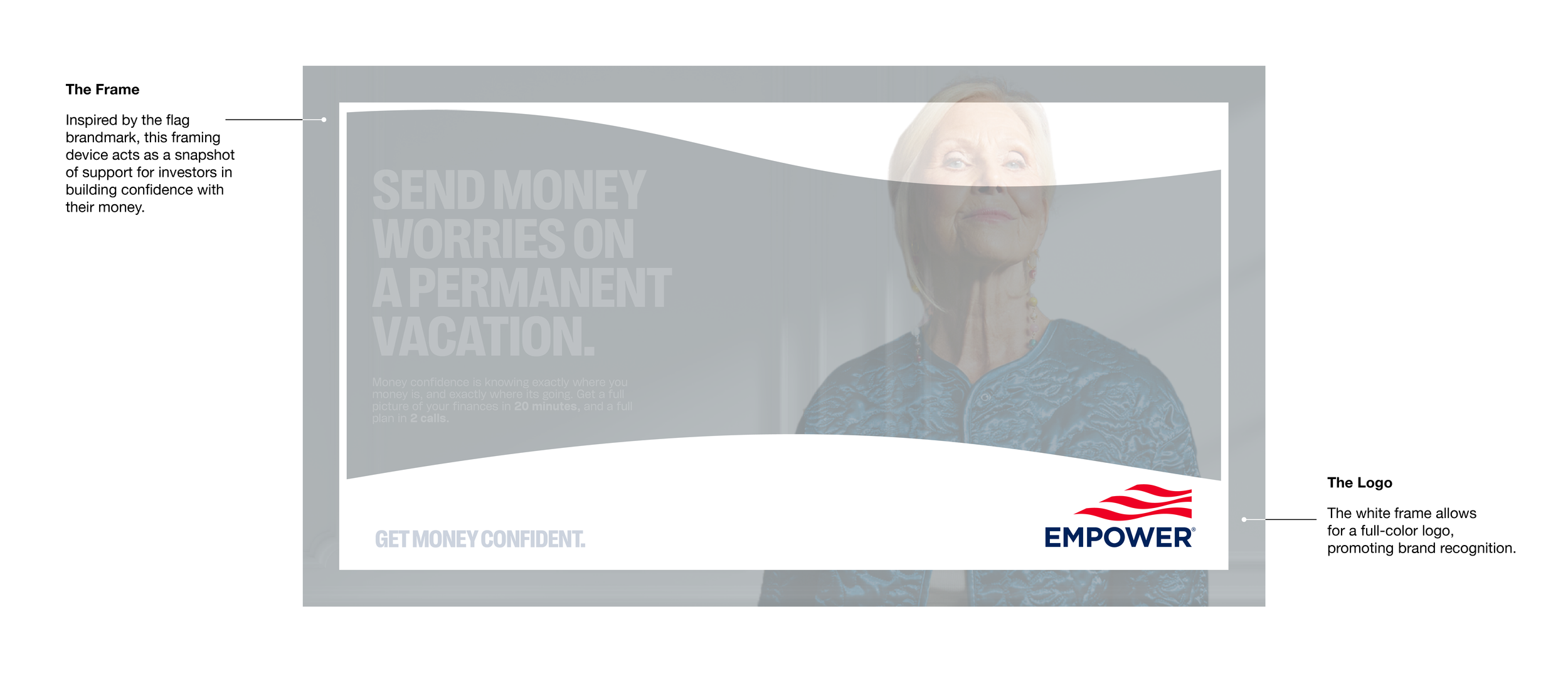
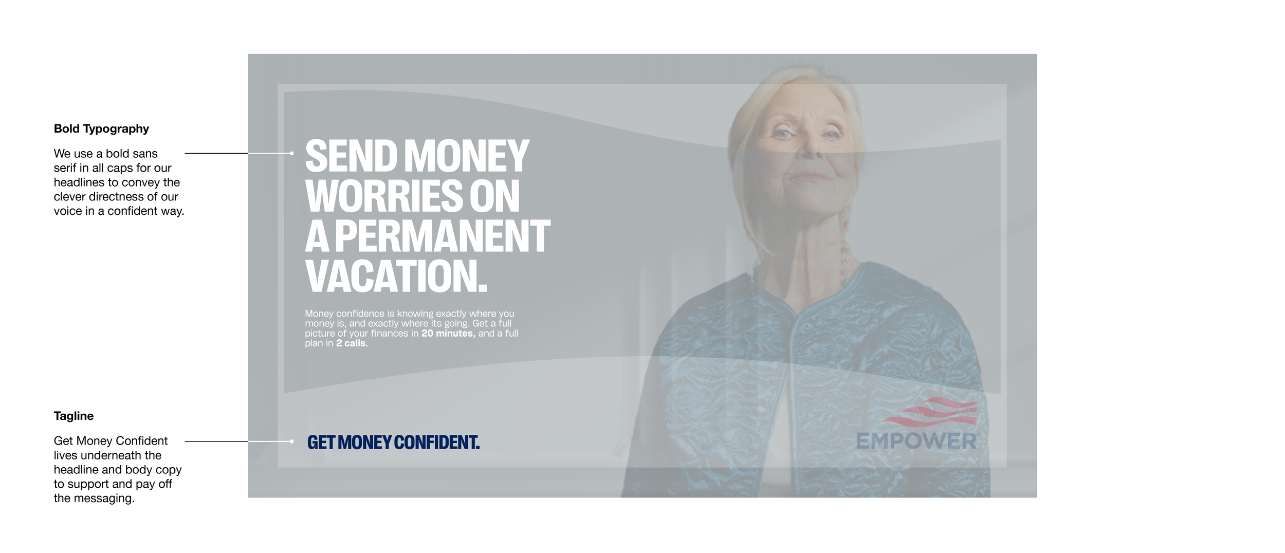
For this direction, I took a bold and empowered (catch my joke?) approach, creating a visual identity that exudes strength, confidence, and decisiveness. I chose an all-caps, bold typeface to amplify a sense of power and self-assurance, reinforcing the idea that investors who choose Empower feel in control. A custom photo border, derived from a spliced wave from the Empower logo, acts as a snapshot of a confident investor. The backgrounds provide subtle environmental hints, offering a glimpse into each investor’s personality and lifestyle, making the brand feel more relatable.
Unlike the first direction, which took a more refined and understated route, Get Money Confident is about owning your financial future with certainty—a message that needed to be reflected in the design. This direction is filled with energy, personality, and vigor, making it my favorite of the two.


