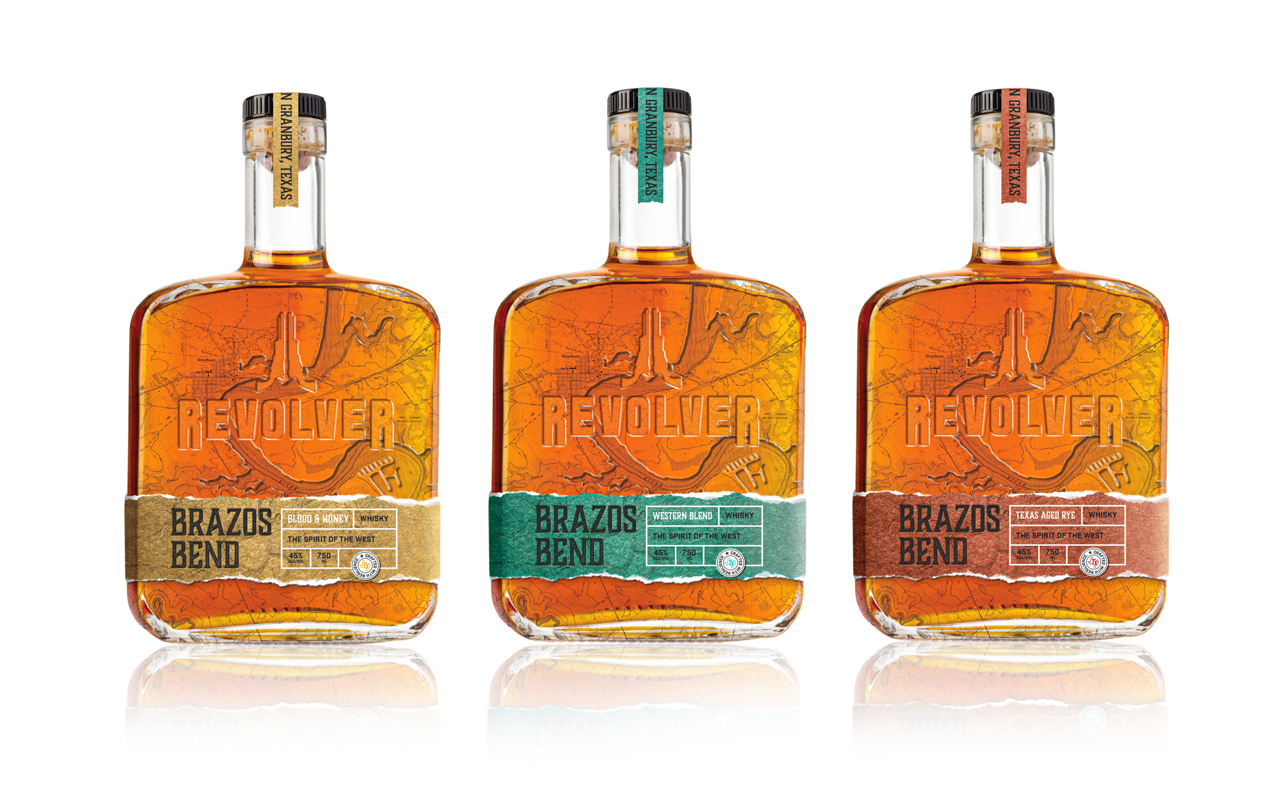
Revolver Brewing — Brazos Bend Whisky
Conceptual Packaging design
2020
VSA Partners inc
Revolver Brewing sought a modern refresh for their signature beer while staying true to their classic identity. Expanding on this vision, I conceptualized Brazos Bend Whiskey, an exclusive small-batch release for their new Dallas pub location.
The name Brazos Bend pays homage to the Brazos River, which flows through Granbury, Texas—the hometown of Revolver’s brewmasters and the foundation of their craft. The design direction reflects the rich history and heritage of the region, reinforcing the idea that this whiskey is locally crafted and deeply rooted in Texas tradition. The packaging balances modern refinement with rustic authenticity, ensuring it resonates with both loyal Revolver fans and new consumers alike.
mood board
Bottle Design
Historic map detail
The map of Granbury, Texas, embossed on the back of the bottle, proudly highlights the whiskey’s origins, reinforcing Revolver Brewing’s deep connection to its roots. This detail invites consumers to form an emotional connection—not just with the whiskey itself but with a brand that takes pride in its heritage.
To balance craftsmanship with sophistication, I designed a ripped-paper label featuring a lustrous metallic texture, evoking a sense of handmade authenticity while maintaining a refined, premium feel. A final sticker seal, showcasing a Texas emblem and Revolver’s signature tagline, serves as the finishing touch; solidifying the brand’s unmistakable identity and adding to the whiskey’s bold, timeless appeal.
Flavor Options
Using different metallic colors shows the range of flavors that could be possible. Depending on the light, these labels could glisten much like the river on a sunny day or in the evening sunset.


